Sunday, 21 August 2011
Friday, 19 August 2011
Tuesday, 16 August 2011
Saturday, 13 August 2011
Architect poster and my view
 | |
| http://www.freecodesource.com/movie-posters/B002WCXP24--peter-eisenman-university-of-phoenix-stadium-for-the-arizona-cardinals-movie-poster.html |
My breakdown of the poster
In this poster there are three main parts that make up the main grid. Each section of the poster have its own part, the top displays what the poster is. In this poster its main focus is the landmark of the 21st century American architecture. The middle is the architect work which is Peter Eisenman in here it is broken up into sub grid for the image and the text. The bottom contains the company that made the poster. In this poster there is about five font sizes that display different meaning to the poster . The main two font that takes all attention is the middle that displays the architect name which has the largest font. As for the second largest font is the name of the building made from the architect. This is follow by the design or the building itself which take one third of the poster . To increase the focus for the middle, I had rule off the top and bottom to create a box that encloses the middle. As for the colour of the poster it uses dark colours this is because they are trying to bring out the night time effect showing that the building is displayed at night and shows how the light is distributed in the building.
Reflection on the project
For this design project it was broken up into three stages. Stage one was to collect information on the architectures work and choose designs that the architect had done that made were inspiration. Stage two was to use the designs chosen to work on the paper model , creature and the dwelling. The last stage is to create the Augmented Reality with the final environment design from the inspiration of the architect.
In Stage one I have chosen the architect Peter Eisenman and looked through his work in which I found two buildings that I was interested and they were the Neues Fussball station in Munchen and the Napoli Tav station competition. From there I work on my paper model and the creature design. After designing the things I started to look at the concept on how the building was designed.
Stage two was to design the models using the concept of the architect design. The concept that i took from the building was the frame work of the Napoli tav station and the outer shell design of the Neues Fussball station. The frame was the internal structure for the building and the main frame work creating its shape. Each of the frame are stuck into the landscape point out just like the Neues Fussball station. where the building looks like it standing out . For covering the building I used two large shells as the roof and having some of the frame work sticking out of the shell.
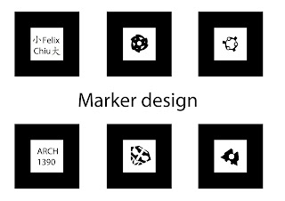
In the Final stage was to place each of the angle of the design on to the box. On the box there is are marker that individually displays different images of the design when displayed in the buildAR. As for the maker design there are six designs and some of the designs relate to my designs. In the end the box would have the designs on each marker.
Sunday, 7 August 2011
Saturday, 6 August 2011
Thursday, 4 August 2011
Subscribe to:
Comments (Atom)


